RV Kitchen Design Ideas for Small Camper Kitchens
Our camper kitchen is the size of a closet. Galley on the driver side, two feet of counter, a sink that doubles as a drying rack because there is nowhere else to put the colander.
I spent a rainy week in March sketching it on graph paper at the kitchen table back home. Measured the counter run. Measured where my elbow hits when I stir a pot. Then I taped paper cutouts to the cabinet faces to see where art and labels would even land before I spent a dollar. Half my first ideas blocked the only drawer. So I moved them.
What finally worked was treating the wall designs and the little decals like part of the layout, not an afterthought. I pulled most of these from an indie design shop, printed test versions cheap, and lived with them a couple weeks before I committed. A few of the links below are affiliate ones, so if you grab a file it helps keep our gas tank full. Here is what survived the planning stage.
The Anchor Print That Set My Whole Counter Layout

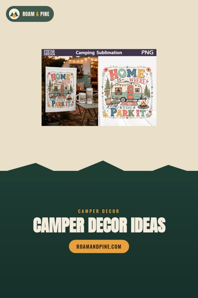
I started with this one because I needed a focal point on the cabinet above the stove, and everything else got planned around it. Printed it at 8 by 10 first to check the scale against my two feet of counter. Too big. Dropped it to 5 by 7 and suddenly the spice shelf below it had room to breathe.
The camper outline in it is simple, which is exactly why it works in a small galley. Busy art in a tight kitchen just makes the wall feel closer. This one sits flat and lets the eye rest.
One nitpick. The lettering has a thin stroke, so if you print at home on a cheap inkjet the way I did the first round, bump the quality setting or the words go faint against the camper shape.
Florals For The Cabinet Door Nobody Wanted To Look At
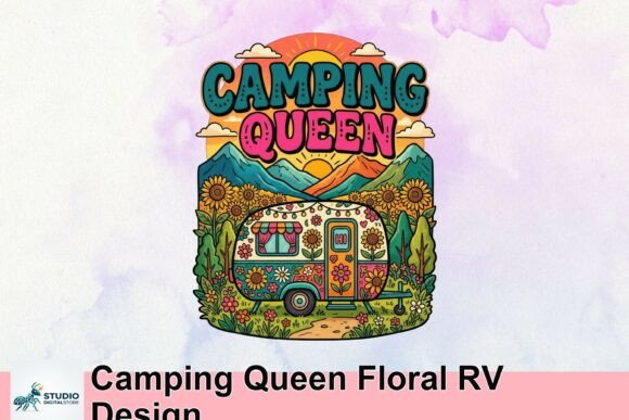
There is one ugly cabinet door right at eye level over my prep area. Plain beige, scuffed, the previous owner’s coffee stain ghosting through. I planned a decal spot for it from the start and this floral design is what landed there.
The flowers warm up the whole galley, which photographs cold under the LED strip I installed. I printed it on sticker paper, cut it to the door panel, and it covers the stain completely. Two summers in, still holding.
Watch the edges if you go the peel-and-stick route. Mine started lifting at the top corner near the vent because heat collects up there. A dab of double-sided tape under the worst corner fixed it.
A Tiny Camper Where The Tiny Spice Rack Lives

When I mapped the storage flow, the spice jars ended up on a narrow shelf by the window because that was the only vertical inch left. The wall above it was awkward and skinny. This little camper design fit the gap like it was measured for it.
I printed it small, framed it in a dollar-store clip frame, and it fills that weird leftover wall without crowding the jars. My niece calls it the baby camper. It stuck.
The colors run a touch saturated on glossy paper. I switched to matte for the second print and it sat better next to the wood-look cabinet vinyl. Glossy threw glare every time the sun came through that window.
The Winged Letter I Turned Into A Drawer Marker

This one started as a logo file, but in my layout planning I needed a way to tell the two identical drawers apart. One holds utensils, one holds the random junk. I shrank this winged RV design down and used it as a marker on the junk drawer pull.
Printed it tiny on label stock, maybe an inch wide, laminated the strip at the library, and stuck it to the drawer face. Now I can grab the right drawer half asleep at 6am making coffee.
It is a clean, bold mark, so it survives shrinking better than the floral stuff did. The only thing is the file is built for a logo crop, so leave yourself a little margin when you resize or the wing tip clips off.
Shirt Art That Became The Backsplash Strip
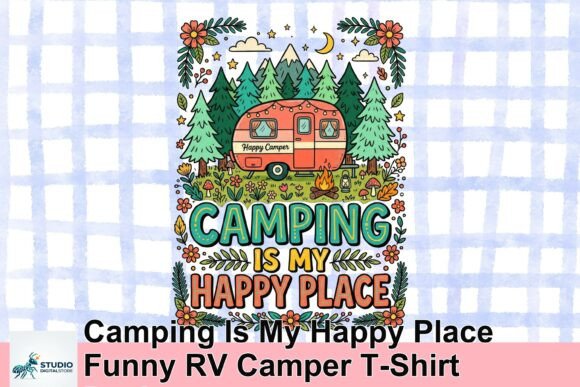
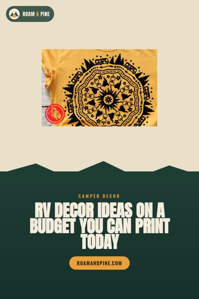
I had a four-inch strip of wall between the counter and the upper cabinet that needed something, and a plain backsplash felt like a waste. This shirt design has a long horizontal layout that fit that strip almost exactly when I cropped the text band.
Printed it on a single long sheet, sealed it with clear contact paper so grease wipes off, and ran it along the strip. It catches steam from the kettle and still cleans up fine after a year of pasta nights.
It is sized for a shirt, so the resolution gets soft if you blow it up to fill a wide wall. I kept mine to the four-inch band and it held sharp. Go wider and you will see the pixels.
The Tropical One For The Coffee Corner Plan

My layout has a dedicated coffee corner, which sounds fancy but is really just the spot where the kettle and the one mug shelf live. I wanted that corner to feel like vacation even when we are parked in a gravel lot off Route 2. This tropical camper design did it.
The palms and the warm tones make a six-inch print feel bigger than it is. I clipped it to the shelf edge so it floats above the mugs. Every morning it is the first thing I see.
The background gradient banded a little when I printed at home. The library laser printer handled the gradient way better than my inkjet did, so I reprint there now for anything with a smooth color fade.
A Monogram That Earned The Cabinet Above The Sink

The cabinet directly above the sink is prime real estate in the layout, dead center, first thing anyone sees. I planned a single clean piece there instead of clutter. This RV monogram won the spot.
It is just initials and a simple mark, which is the point. In a galley this small, one strong shape beats five small ones. I printed it on heavy cardstock, no frame, just stuck flush to the cabinet with mounting squares so it sits flat against the door.
The file gives you the VR or RV arrangement. I almost printed the wrong orientation, caught it on the test sheet. Print the cheap test first or you will waste your good paper figuring out which way the letters go.
The Campfire Scene For The Dim Corner By The Fridge
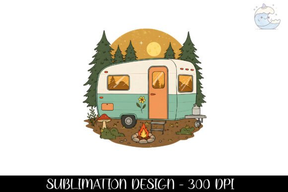
There is a corner by the mini fridge that gets zero light. In planning, I knew bright art would just look muddy there, so I went the other way and picked something that owns the dark. This nighttime campfire scene fit the mood of the corner instead of fighting it.
The dark blues and the little glow of the fire read fine in low light. I printed it on matte so the dim corner does not throw glare, framed it cheap, and it makes that dead corner feel intentional now.
Being a PNG, it dropped straight into my layout mockup without any background mess. One small thing, the dark tones eat a lot of ink at full size, so I sized it modest. Big print of an all-night scene drains a cartridge fast.
Wrap Art I Repurposed For The Open Shelf Edge
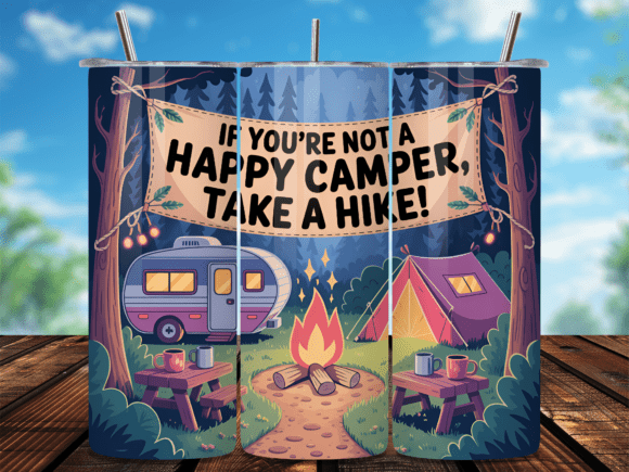
This is built as a tumbler wrap, a long skinny band. In my storage flow I have one open shelf with an exposed plywood edge that always bugged me. The wrap shape suited that edge exactly.
I printed the band, trimmed it to the shelf length, and ran it along the front lip like trim. Now the raw plywood is hidden and the shelf looks finished. Took ten minutes once I stopped overthinking it.
The wrap is curved-friendly by design, so on a flat edge the proportions look slightly stretched if you do not crop the ends. I cut the curved end caps off and used just the middle band. Sat much cleaner.
The Flat-Style Trailer For The Magnet Board
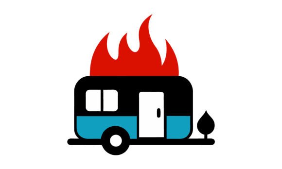
I built a little magnet board into the layout, just a sheet of galvanized steel behind the cabinet door, for the grocery list and the kid’s drawings. I wanted one printed magnet that set the tone. This flat-design trailer became it.
The flat illustration style holds up great at small sizes, no fussy details to lose. I printed it on magnet sheet, cut it out, and it lives top-left on the board holding nothing, purely decorative. The lists go under it.
The magnet paper I used was thin and curled at the corners in the heat. Next batch I will spring for the thicker magnet stock. Cheap magnet sheet plus a hot parked camper equals curl.
The Phrase Print Over The Fold-Down Table

Our table folds down off the wall, and when it is up the bare wall behind it is the biggest blank space in the kitchen. I saved that wall in the plan for one statement piece you actually read while eating. Adventure Awaits won.
I printed it larger than anything else, 8 by 10, because it finally had room to be big. Framed in thin black, centered over where the table folds down. It is the one spot in the galley where I let a design breathe.
The script font is lovely but thins out at the loops, so a big print on textured paper lost a little crispness. Smooth matte cardstock kept the letters clean. Skip the linen-texture paper for fine scripts.
The Cut-File Crew For The Drawer Fronts
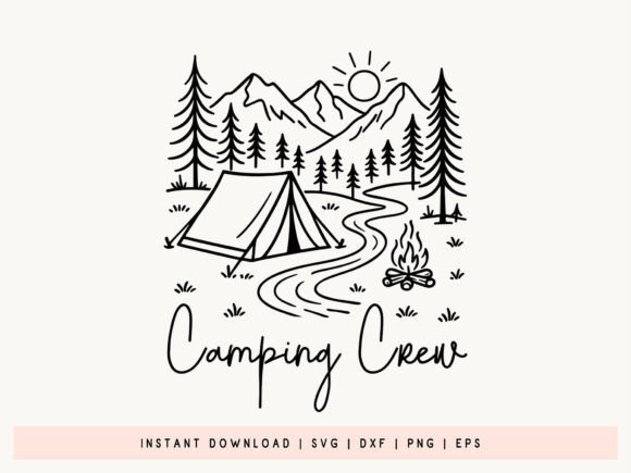
This is the one cut file in the bunch, and I used it for the part of the layout I am proudest of, labeled drawer fronts. SVG meant I could resize each one to the exact drawer width without going fuzzy. That mattered because my drawers are all different sizes from the previous owner’s repairs.
I cut them in vinyl on a borrowed machine at a friend’s place in town, weeded them, and applied one to each drawer face. Utensils, towels, snacks. The whole storage flow finally makes sense to anyone but me.
Weeding the small letters was fiddly and I lost a couple thin pieces to my own impatience. Go slow on the tiny counters, or print-and-cut the smallest ones instead of weeding vinyl. My first crew design has a missing leg I never fixed.
Frequently Asked Questions
What kind of paint do you use on rv walls?
I learned this one by ruining a test patch. Regular wall paint slid right off the slick laminate panels our camper came with. What finally stuck was a bonding primer first, the kind made for slick surfaces, then a satin latex over it.
I did one small panel by the door as a tester before committing to the whole galley. Glad I did. Satin wipes down when grease splatters from the stove, flat would have grabbed every fingerprint. Two thin coats beat one thick one every time on those panels.
Can you paint rv walls?
Yep, you can. I did ours over a long weekend parked in the driveway with the windows cracked. The trick is prep, not the paint. I wiped every panel down with a degreaser, scuffed the shine with a fine sanding sponge, then primed.
Skip the sanding and the prep and it peels in a season, I have seen it on a buddy’s trailer. Took my time, and two summers later the galley walls still look fresh. The painting was the fast part. The wiping and sanding ate the whole Saturday.
Can you put wallpaper on rv walls?
Short answer, yes, and peel-and-stick is the way to go in a camper. I used it on the backsplash strip before I switched to a printed design. It went up easy and came off without wrecking the wall when I changed my mind.
The one thing to watch is heat. Mine started lifting at the top edge near the vent where it gets warm. Smooth it slow, push the air bubbles out toward an edge, and hit the corners near any heat source with a little extra pressure. Bubbles trapped in the middle never flatten out.
Can you paint over rv walls?
You can paint right over the existing panels, no need to tear anything out, which is what makes it doable in a weekend. I painted directly over the original glossy beige once I primed it.
The part people skip is testing one spot first. I did a hidden panel inside a cabinet to see if the paint would grip before I touched the visible walls. It gripped, so I went ahead. If your test patch scratches off with a fingernail after it dries, you needed more prep, not more paint.
Before You Pack Up
The thing that made our kitchen work was planning the art and the labels into the layout, not stapling them on at the end. Counter first. Storage flow second. Then the designs filled the gaps that were left, sized to the exact inch.
Last week I caught my kid pointing out the baby camper print to a friend at the campground in Vermont. Said it was the best part of the kitchen. The kitchen with the two feet of counter and the sink full of drying spoons.
More Camping Ideas We Love
Heads up: some links in this post are affiliate links. If you grab a file we love, we may earn a small commission at no extra cost to you. We only feature designs we would happily pack on our own trip.