Smores Bar Sign We Love
My nephew turned ten at a state park up near Blue Ridge, and the whole plan was marshmallows. That was it. We had a fire ring, a card table, and a bag of jumbo mallows that, predictably, I bought two of because the first one never survives the cooler.
What the table needed was a sign. Something that said this pile of chocolate and crackers was a station, not a mess my sister was about to clean up. I printed one at 8am on the cabin’s ancient printer. It came out a little crooked. Nobody cared. The kids lined up like it was a real bar.
Most of these I grabbed from an indie design shop, the kind where one designer sells the file and you print it yourself. A few I had cut on metal later for the camper. Below are the ones I actually used, plus the ones I keep going back to.
The spinner that gave grownups their own corner
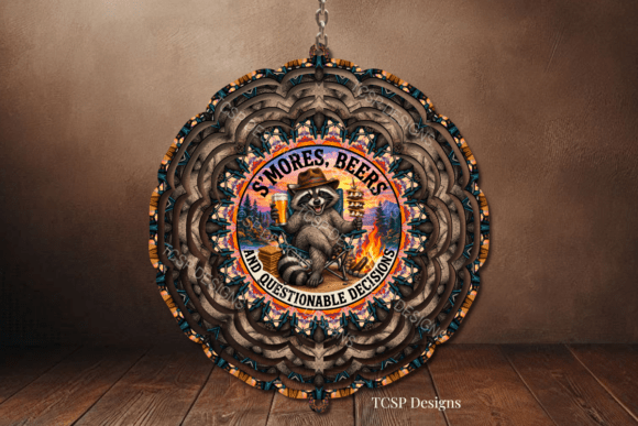
This one is a wind spinner design, marshmallows and a beer can stacked up like a little totem, and I will be honest, I did not plan to love it. I printed the flat version on heavy cardstock first, taped it to a stake behind the cooler so the adults knew where the cold ones lived. Worked.
Later I had the actual spinner cut. It hangs off the camper awning now and twists every time the wind off the lake picks up. The art reads from a distance, which matters when your sign is competing with a campfire and six kids yelling.
One nitpick. The detail in the can label gets muddy if you print it small. Keep it at least letter size or it just looks like a brown blob on a stick.
The group-hug PNG I slapped on everything
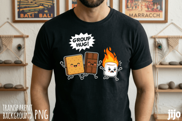
A clean PNG of little s’mores characters squished together in a hug. Transparent background, which is the whole point. I dropped it onto the top of our menu card, then onto the kids’ goodie bags, then onto a thank-you note my sister made me write afterward.
Because it has no background you can layer it over a wood texture or a kraft-paper color and it just sits there looking right. I printed a strip of them as a banner across the top of the bar sign too.
The nitpick is resolution. It is fine at small sizes, name-tag size, sticker size. Blow it up to a full sheet and the edges go a touch soft. So I kept it small and used it a lot.
Pattern paper for everything that needed a background
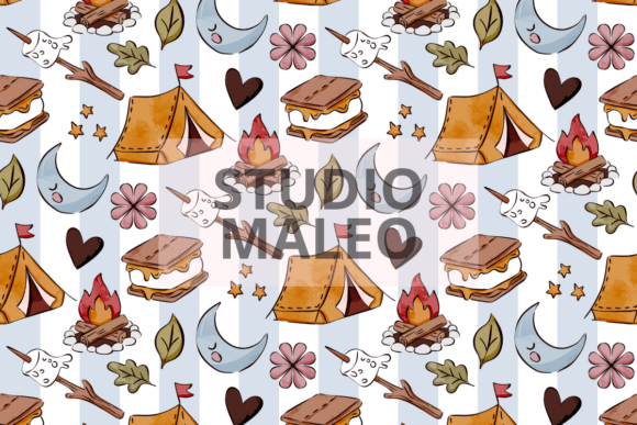
This is a seamless pattern, little tents and mallows repeating, and a seamless one means you can print it across a whole page with no awkward seam where it loops. I used it as the backdrop layer behind the lettering on my main sign so the white space did not look so bare.
I also printed two sheets, cut them into squares, and used them as cheap placemats under the chocolate bowls. Grease soaked through by the second hour. Whatever. They were paper.
Watch the color. On the cabin printer the browns came out darker than the screen, almost burnt-looking, and it fought with my black text. I lightened the pattern opacity before the real print and it read fine.
The cocktails sign that does double duty in December
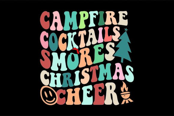
Campfire cocktails meets s’mores meets a holiday lean. I know, it was August. But I print this one twice a year. At the party I used it over by the grownup drinks, the spiked cocoa my brother-in-law insists on making even when it is 80 degrees out.
The Christmas angle is subtle enough that it does not look wrong in summer. Come December it lives on the camper door when we do a cold-weather fire night. Same file, two seasons, one print job each.
Nitpick, the lettering is busy. I would not hand this to a kid expecting them to read it fast. It is a vibe sign, a leaning-against-the-thermos sign, not a directional one.
Campfire Social Club, our unofficial bar name
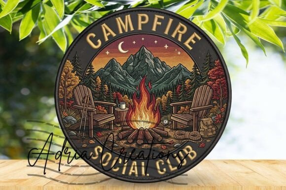
This came as a door-sign and coaster set, and that combo turned out to be the sleeper hit. I printed the door-sign part big and hung it on a stick behind the table so the whole setup got a name. Campfire Social Club. The kids decided that was the password to get a second s’more.
The coaster art I printed on cardstock, laminated, and set under the cocoa mugs. They wiped clean. One survived the whole weekend and is still in the camper cupholder, corner peeling, because of course it is.
My one gripe is the coaster size on the file. Mine printed a hair small for a standard mug, so the mug overhung the edge. Scale it up about ten percent before you cut and you are good.
The round lake-scene sign that looked expensive for nothing
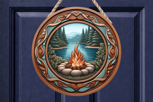
A round door-sign with a campfire and a lake scene, meant to look like a wood round. I did not have wood, so I printed it on the heaviest matte stock the library copier would take and glued it to a paper plate to stiffen it. From four feet away? Looked like we paid somebody.
It sat propped against the cooler as the welcome sign, the first thing people saw walking up from the parking lot. The lake in the art matched the actual lake behind us, which felt like cheating in a good way.
The nitpick is the circle cut. Cutting a clean round by hand is a pain and mine came out slightly egg-shaped. If you have access to a craft cutter, use it. If not, trace a real bowl, do not freehand it like I did.
The personalized metal sign that finally said our name
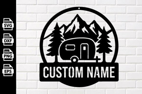
This is a personalized campfire sign design built to be cut on metal, and you put your own name or family line into it. I sent this version off to get cut after the party because the paper signs were great for a day but I wanted one that lived on the camper permanently.
For the party itself I printed the proof on regular paper just to check the spacing of the name. Good thing. The text was tight against the edge and I nudged it in before paying for metal.
Nitpick that applies to all the metal ones, you are editing a design file, so check your spelling at full size before you commit. Metal does not let you reprint for free.
A second name layout for when the first does not fit
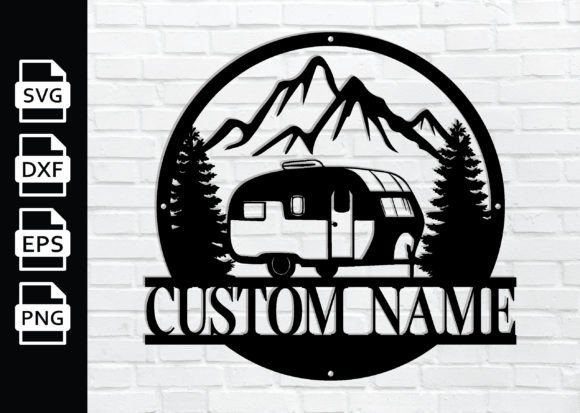
Same personalized campfire idea, different layout. I keep more than one of these on hand because names are different lengths and what looks balanced for a short last name looks cramped for a long one. This layout has more breathing room horizontally.
I tested it as a paper print taped to the camper door first, stood back, squinted. That squint test tells you more than the screen does. This one read clean from the firepit, maybe fifteen feet.
The gripe is the font weight. It is on the thinner side, so if you want it cut and powder-coated dark on a light wall, fine. Light on dark and the thin strokes start to disappear at distance.
The bolder cut for people who sit far from the fire
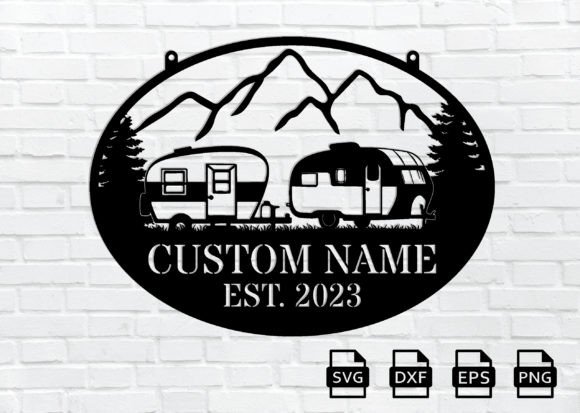
Another take on the metal campfire sign, this one heavier in the linework. I grabbed it specifically because the thinner layouts vanish from across a big site, and our family reunion fire pit is huge, twenty-plus feet across.
Printed the proof, taped it to a tree at the actual distance people would read it from, walked back to my chair. Could read it from the chair. That was the whole test and it passed.
Nitpick, all that boldness eats your space, so a long name gets squeezed. I have a cousin with a hyphenated last name and it would not have fit. Short names only on this one, or accept a tiny font.
The layout my sister actually picked
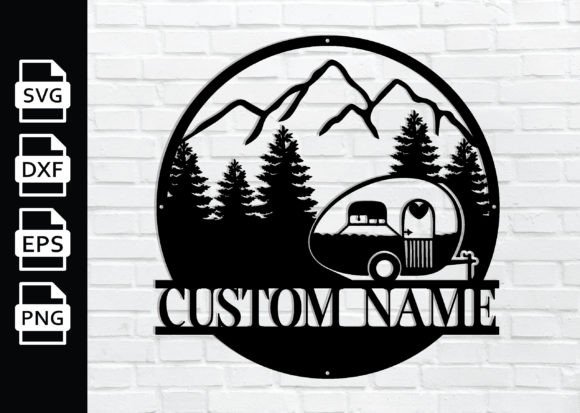
When I showed my sister the metal options for the cabin she shares, this was the one she pointed at. Slightly more decorative than the others, a little flourish around the campfire. She wanted it for the porch, not the camper.
I did the usual paper proof on the library copier, handed it to her, let her live with it on the fridge for a week. She still liked it. That week-on-the-fridge test has saved me from a few signs I would have regretted.
The nitpick here is the flourish detail, it needs a decent cut quality to look intentional. A cheap cut and those little swirls go blobby. Spend the few extra dollars on the better metal finish for this one.
The original campfire sign I keep coming back to
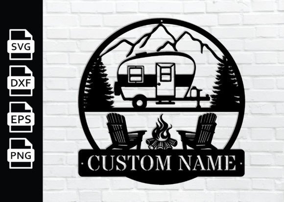
This is the plainest of the personalized metal bunch and somehow the one I reach for most. No flourish, just a clean campfire and your name. It does not fight with anything else on the wall.
I have this version cut and hung by the camper steps, name and all, since last spring. Rain has not touched the color. People ask where I got it and I just say I made the file myself, which is sort of true.
Nitpick, plain means the name carries the whole sign, so a boring font choice shows badly here. There is nowhere to hide. Pick the name font deliberately and print a proof before metal, every time.
The motorhome sign that found a home on the awning post
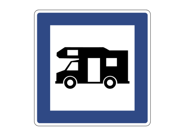
A camping sign aimed at motorhomes and RVs, which fit us perfectly because we are technically a motorhome now, not a tent. I printed it big, mounted it on foam board from the dollar store, and zip-tied it to the awning post for the weekend.
It marked our site so the reunion crowd could find our spot in a field of forty identical white rigs. Honestly the most useful sign of the bunch, less decoration, more do-not-walk-past-our-camper.
The gripe is it is wide. Mine ran past the edge of a standard sheet so I printed it across two pages and taped the seam, and the seam shows if you look. Print it at a copy shop on one big sheet if you can.
Frequently Asked Questions
What to bring to a campfire party?
Off the top of my head, from the last one we threw: more marshmallows than you think, then a backup bag, because the first bag never makes it past the drive. Long skewers, not the bendy dollar ones that droop into the fire. Chocolate that does not melt in the cooler before dark.
Then the stuff people forget. A real lighter, not matches that went soft in a damp glovebox. Wet wipes. A headlamp or two. And a sign or two so the food table reads as a station and not a heap, which is the whole reason I started printing these.
What is a s’mores bar?
First time my nephew asked me that, I just pointed at the table. It is the setup where instead of one person assembling s’mores, you lay out the parts, crackers, chocolate, mallows, maybe some add-ons like peanut butter cups, and a sign telling people to build their own.
That is it. The sign is what makes it feel like a bar instead of three open bags. Ours had a Campfire Social Club sign on a stick and suddenly the kids were lining up politely instead of grabbing fistfuls.
What is partyisntover campfire bimmer about?
Honestly? I had to look that one up too, a camp mom asked me at the reunion. As far as I can tell it is a niche phrase floating around campfire-party hashtags, the kind of catchphrase that ends up printed on a sign or a tumbler. Not a brand I have ever bought from.
What I tell people is do not chase the exact phrase. If you like the campfire-party vibe it is going for, grab one of the social club or campfire signs here and put your own name on it. Lasts longer than a hashtag anyway.
What is a bonfire party?
Bigger fire, basically. Our s’mores thing at Blue Ridge was a small contained fire ring. The reunion in the field was a proper bonfire, the kind you stand back from and feel on your face from ten feet.
Same food, same signs, just more people and a fire you respect more. That is actually why I went looking for the bolder metal signs, you need lettering that reads from a chair set way back from a big fire, not the thin stuff that disappears past the heat.
Before You Pack Up
We packed up Blue Ridge on a Sunday with chocolate on every kid’s shirt and the crooked 8am sign somehow still standing. I kept that one. It is in the camper door pocket, marshmallow smudge and all.
If you only print one thing, print the sign that names your bar. Campfire Social Club, or your own kid’s name on a campfire. The rest is just marshmallows and a fire you have to keep an eye on, which you were going to have anyway.
More Camping Ideas We Love
Heads up: some links in this post are affiliate links. If you grab a file we love, we may earn a small commission at no extra cost to you. We only feature designs we would happily pack on our own trip.